In the fast-paced world of data analysis and project management, having the right tools at your fingertips can make all the difference. Pine BI is a revolutionary Excel add-in that allows users to create advanced dynamic Excel charts and dashboards with just a few clicks. This article delves into how Pine BI can transform your Excel workbooks into modern and engaging dashboards, making data visualization easier and more effective than ever before. Read on to discover why Pine BI is an indispensable tool for anyone looking to elevate their data analysis game.
Article Outline
- What is Pine BI and How Does It Work?
- Why Use Pine BI for Data Visualization in Excel?
- Creating Advanced Dynamic Excel Charts with Pine BI
- How to Install and Get Started with Pine BI
- Key Features of Pine BI: From Gauges to Gantt Charts
- Building Engaging Dashboards: A Step-by-Step Guide
- How Pine BI Simplifies Project Management
- Real-World Applications: Case Studies and Success Stories
- Tips and Tricks for Maximizing Pine BI’s Potential
- Frequently Asked Questions About Pine BI
What is Pine BI and How Does It Work?
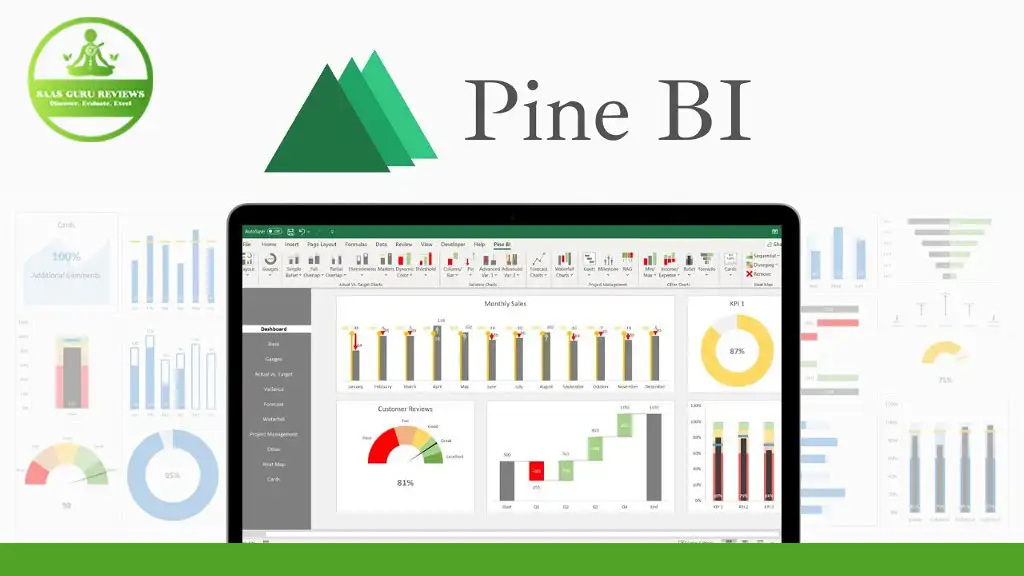
Pine BI is a powerful Excel add-in designed to enhance your data visualization capabilities within Microsoft Excel. Built on native Excel features, Pine BI allows users to create advanced dynamic Excel charts and dashboards effortlessly. Pine BI is a VBA-based tool that integrates seamlessly with Excel, providing a user-friendly interface for creating complex visualizations for data analysis.
Since Pine BI is built on native Excel features, it ensures that all visualizations created with Pine BI are completely dynamic and editable. This means that users have full control to edit the charts further, just like normal Excel charts.
Why Use Pine BI for Data Visualization in Excel?
Data visualization is crucial for making informed decisions, and Pine BI takes this to the next level by allowing users to create advanced dynamic Excel charts in a single click. Unlike standard Excel charts, Pine BI charts are dynamic and engaging, making them perfect for presentations and reports.
Pine BI allows users to create one or multiple charts at the same time, turning Excel workbooks into modern and engaging dashboards. This not only saves time but also enhances the overall quality of your data analysis and project management efforts.
Creating Advanced Dynamic Excel Charts with Pine BI
Creating advanced dynamic Excel charts with Pine BI is straightforward. The Pine BI Chart Editor allows users to automatically create charts in seconds. Included are more than 25 of the most widely used and complex visualizations, such as waterfall charts, gauge charts, and target charts.
These charts can be added as a template to be further expanded or directly based on actual data. This flexibility allows users to create advanced dynamic charts that are completely dynamic and users have full control to edit them further.
How to Install and Get Started with Pine BI
Getting started with Pine BI is simple. First, download the Pine BI add-in from AppSumo or the official Pine BI website. Once downloaded, follow the installation instructions to add Pine BI to your Excel.
After installation, you can access Pine BI from the Excel ribbon. The intuitive interface makes it easy to start creating advanced dynamic Excel charts and dashboards right away. Pine BI is built on native Excel features, making it easy for users familiar with Excel to get started quickly.
Key Features of Pine BI: From Gauges to Gantt Charts
Pine BI offers a wide range of features that make it a versatile tool for data visualization. Some of the key features include:
- Gauge Charts: Perfect for displaying performance metrics.
- Gantt Charts: Ideal for project management and tracking timelines.
- Waterfall Charts: Useful for visualizing financial data and changes over time.
- Target Charts: Great for comparing actual vs. target performance.
These features allow users to create advanced dynamic Excel charts that are both visually appealing and highly informative.
Building Engaging Dashboards: A Step-by-Step Guide
Building engaging dashboards with Pine BI is a breeze. Here’s a step-by-step guide to get you started:
- Open Excel and Load Pine BI: Access Pine BI from the Excel ribbon.
- Select Your Data: Choose the data you want to visualize.
- Choose a Chart Type: Use the Pine BI Chart Editor to select from over 25 chart types.
- Customize Your Chart: Edit the chart to fit your needs, including colors, labels, and more.
- Arrange in a Grid: Arrange multiple charts in a grid to create a cohesive dashboard.
- Save and Share: Save your dashboard as an Excel workbook or export to PowerPoint for sharing.
How Pine BI Simplifies Project Management
Pine BI is not just for data visualization; it’s also a powerful tool for project management. With features like Gantt charts and performance metrics, Pine BI allows users to track project timelines and performance in real-time.
The ability to create advanced dynamic Excel charts means that project managers can quickly visualize project progress and identify potential issues before they become major problems. This makes Pine BI an invaluable tool for keeping projects on track and ensuring successful outcomes.
Real-World Applications: Case Studies and Success Stories
Pine BI has been used by professionals across various industries to enhance their data visualization and project management efforts. Here are a few success stories:
- Financial Services: A financial analyst used Pine BI to create dynamic financial reports, saving hours of manual chart creation and improving report accuracy.
- Marketing: A marketing manager used Pine BI to visualize campaign performance, helping to identify successful strategies and areas for improvement.
- Healthcare: A healthcare administrator used Pine BI to track patient outcomes, leading to more informed decision-making and improved patient care.
These case studies demonstrate the versatility and effectiveness of Pine BI in real-world scenarios.
Tips and Tricks for Maximizing Pine BI’s Potential
To get the most out of Pine BI, consider these tips and tricks:
- Leverage Templates: Use pre-built templates to save time and ensure consistency.
- Customize Charts: Take advantage of the full customization options to tailor charts to your specific needs.
- Stay Updated: Keep your Pine BI add-in updated to access the latest features and improvements.
- Use Multiple Charts: Combine different chart types to create comprehensive and engaging dashboards.
By following these tips, you can maximize the potential of Pine BI and take your data visualization to the next level.
Frequently Asked Questions About Pine BI
Q: Do I need to install Pine BI on every computer? A: No, users do not need to install Pine BI on every computer. Visualizations created with Pine BI can be shared as Excel workbooks or exported to PowerPoint and shared with users without the add-in installed.
Q: Are Pine BI charts editable? A: Yes, Pine BI charts are completely dynamic and editable. Users have full control to edit the charts further, just like normal Excel charts.
Q: Can Pine BI handle complex data sets? A: Absolutely. Pine BI is designed to handle complex data sets and create advanced dynamic Excel charts effortlessly.
Q: Is Pine BI suitable for beginners? A: Yes, Pine BI is user-friendly and suitable for users of all skill levels. The intuitive interface and built-in templates make it easy for beginners to get started quickly.
Summary of Key Points
- Pine BI is a powerful Excel add-in for creating advanced dynamic Excel charts and dashboards.
- Built on native Excel features, Pine BI ensures that all visualizations are dynamic and editable.
- Pine BI offers over 25 widely used and complex visualizations, including gauge charts, Gantt charts, and waterfall charts.
- Users can quickly create engaging dashboards by arranging multiple charts in a grid.
- Pine BI simplifies project management by providing real-time tracking and visualization tools.
- The add-in is suitable for both beginners and advanced users, thanks to its intuitive interface and customizable options.
- Visualizations created with Pine BI can be shared as Excel workbooks or exported to PowerPoint, making collaboration easy.
By leveraging the power of Pine BI, you can transform your Excel experience, making data analysis and project management more efficient and effective.